Sure your feature passed the unit tests, and QA says it's good to go - but is it? To really be sure, here are four types of tests that are best to consider critical to every feature from the start. Include these tests to improve the accessibility of your features and assist your users in successfully completing tasks.
Color Contrast
#Yes, this old chestnut again - the truly lowest-hanging fruit that you can pick and improve for any feature release. You may feel you've heard enough about it, but clearly, as a collective, we aren't doing a great job actually following through on ensuring color contrast of our interfaces. The WebAIM Million report from 2022 found text color contrast issues on 83.9% of home pages tested, making it the top detected error.
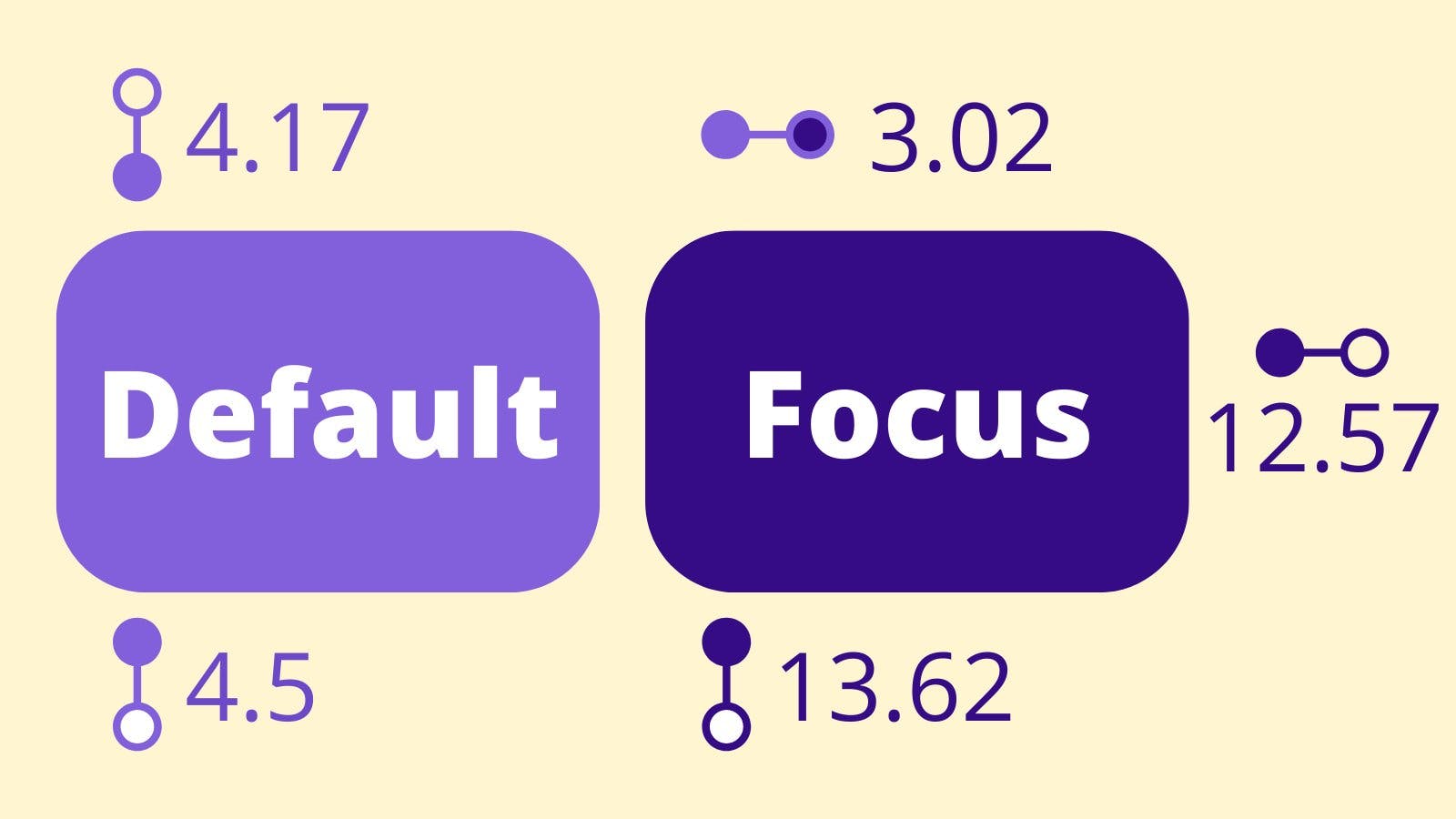
The minimum contrast ratios for WCAG AA are defined as:
- 4.5:1 for normal text
- 3:1 for large text - defined as 18.66px and bold or larger, or 24px and larger
- 3:1 for graphics and user interface components (such as form input borders)
Color contrast checking is available for design tools, across dev tools, and via many online tools. I also enjoy this Mac desktop tool, Contraste App that can pick colors for comparison from any window on your screen.
It is fairly easily detectable by automated tools, too, such as the following browser plugins:
- WAVE from WebAIM (used to generate the report)
- axe
- Accessibility Insights FastPass (uses axe-core with additional features)
Some of my favorite online tools for checking and choosing color contrast:
- WebAIM Contrast Checker
- tanaguru contrast finder - helps find the next-closest matches to create a contrasting pair
- contrast ratio - a simple visual checker to test contrast pairs and updates to a unique URL
- Colour Contrast Checker - another web app but with controls to adjust your colors and creates a unique URL to share, also available as a browser extension
To address precisely the challenge of ensuring an accessible color palette more efficiently, I've created the package a11y-color-tokens.
Interactive Element Color Contrast
#We often focus on text contrast, so the part about the contrast of user interface components is often forgotten. Particularly tricky is the contrast across states of interactive elements. For example, buttons may have five contrast considerations!
Meet ButtonBuddy and learn more about button contrast, as well as generate your own accessible palette. And if you are trying to get by without underlining links within text blocks (which you should really re-consider), use Contrast Triangle to compute the three colors needed since a link using only color to distinguish itself must have enough contrast against the surrounding text.
Bonus color fix: Windows High-Contrast
#"Bonus" as in an extra tip, but resolving for this mode very much counts as a baseline requirement for color contrast!
Some of your users may be modifying their Windows machine to use a "high contrast" theme, which corresponds to the "forced colors" spec for CSS. In this mode, almost all colors are replaced by a reduced palette. This can cause a loss of meaning of icons, cause critical graphics like your logo to be visually hidden, or detrimentally remove boundaries between UI elements.
Learn more and review techniques for handing high-contrast/forced colors mode with CSS.
Keyboard Interaction
#If an interaction relies on a mouse-initiated action, it needs to be keyboard accessible too. This means it may need to respond to Space and/or Enter as a trigger (hint: you get that for free with <button>).
Here are some keyboard interactions to evaluate for your feature:
- If it opens something, it may need to close with Escape.
- If it's scrollable, it needs to respond to Up/Down arrow keys.
- If it's a group of related options (like autocomplete or tabs), it may need to respond to Up/Down or Left/Right arrow keys (search phrase: roving tabindex).
- If it opens a dialog/modal, it needs to prevent tab access with elements outside of that experience (search phrases: "trapping focus" and "inert").
- If it's interactive at all, it needs to be able to gain keyboard focus, and that focus needs to have a visible style (which is test #3).
- If a sighted mouse user can explore and make independent selections (like in an autocomplete), a keyboard user needs to be able to as well. This likely means allowing a combination of tab, arrow keys, and Enter to explore and then make a selection.
- If a
:hovertriggers content, then so should:focus(ex. menus). You will also need a way to close this content, whether that's a tap/click outside or Escape key, and ensure that the method you choose is also accessible for touchscreen users.
When you try to create a "pure CSS" solution for interactive experiences, you are quite likely failing to meet these conditions. To ensure the accessibility of your interface, JavaScript is a necessary addition to accomplish focus management, respond to keyboard events, and toggle ARIA attributes. In my article for Smashing, I review JavaScript requirements for accessible custom controls.
Visible Focus
#Focusable elements require visible focus so that sighted keyboard users can track where focus is on the page. "Visible" means there is a change between the unfocused and focused states - often an outline, sometimes a color change.
Native focusable elements include:
- form controls:
input,select,textarea buttonasummary
There are rules for defining focus states which fall under WCAG 2.4.7 - Focus Visible and which is being further clarified in WCAG 2.2 with 2.4.11 - Focus Appearance (Minimum), which at present is a draft but approaching a finalized state.
Frequently, the reason this is removed is due to feeling the native browser style is not attractive or doesn't fit in with the design choices of the app. Over the years, this has led to developers completely removing focus outlines without a fallback style.
In 2021, evergreen browsers actually switched their default focus behavior to that of the modern CSS pseudo selector :focus-visible, which is designed to only show a default outline based on heuristics. In practical terms, this generally means it will show for focusable controls when keyboard navigation is detected but not mouse click. This functionality removes the weight behind the argument of focus styles being "ugly" since it reduces the scenarios where it is present.
The test here is to make sure you have either allowed browser default styles or that your custom focus style meets the WCAG criteria. Sara Soueidan has created a comprehensive guide to designing accessible, WCAG-compliant focus indicators.
Review my technique for standardizing focus styles using custom properties to design a consistent yet flexible method to manage focus across your site or application.
Zoom Levels
#You've tested across viewport sizes using browser dev tools as well as on real mobile devices, and you're happy with your site's responsive behavior. But you're probably missing one test point: desktop zoom.
WCAG 1.4.10 - Reflow provides the condition that your feature should be able to accommodate desktop zoom up to 400%. At this high zoom level, your layout probably kicks into what you may consider your "mobile" layout, but importantly the context of these users is different. Additionally, their orientation aspect ratio is closer to landscape (wider than height), whereas your "mobile" styles probably assume a default portrait (taller than width) orientation.
Some examples of possible issues when your layout doesn't accommodate high zoom:
- sticky navigation that covers half or more of the viewport
- contained scroll areas that assume a mobile portrait aspect ratio become unscrollable/cut-off
- unwanted results when using fluid typography techniques
- overflow or overlap issues that cut-off content
- margin and padding spacing appearing too large relative to the content size
This particular criterion has become something I've created a few resources on. Check these out to learn more about what can be affected and modern CSS ways to anticipate, address, and reduce potential issues:
- Desktop Zoom and Reflow - discusses the criteria and section spacing
- More information about the impact of high zoom and handling it with thoughtfully applying responsive units
- Contextual spacing techniques that affect small screens and high zoom levels as an article and my recorded presentation from beyond tellerrand
Begin incorporating these four tests not just at the end, but include their consideration at the beginning of feature development. Share this knowledge with designers, project managers, and even business owners.
Best of luck on your journey to implementing more accessible features!